
Rogelli
Brand identity
Guidelines & Production
Art Direction
Rogelli is a Dutch family business that has grown over three generations into an international sportswear brand spanning cycling, running, triathlon, fitness and commuters. Over the years, Rogelli's design decisions were made independently of one another: new products, new markets, new logos, without a shared visual foundation to guide them. What emerged no longer matched who Rogelli actually was, a brand built on accessibility and the enjoyment of riding, not the performance driven aesthetic it had drifted into by default.
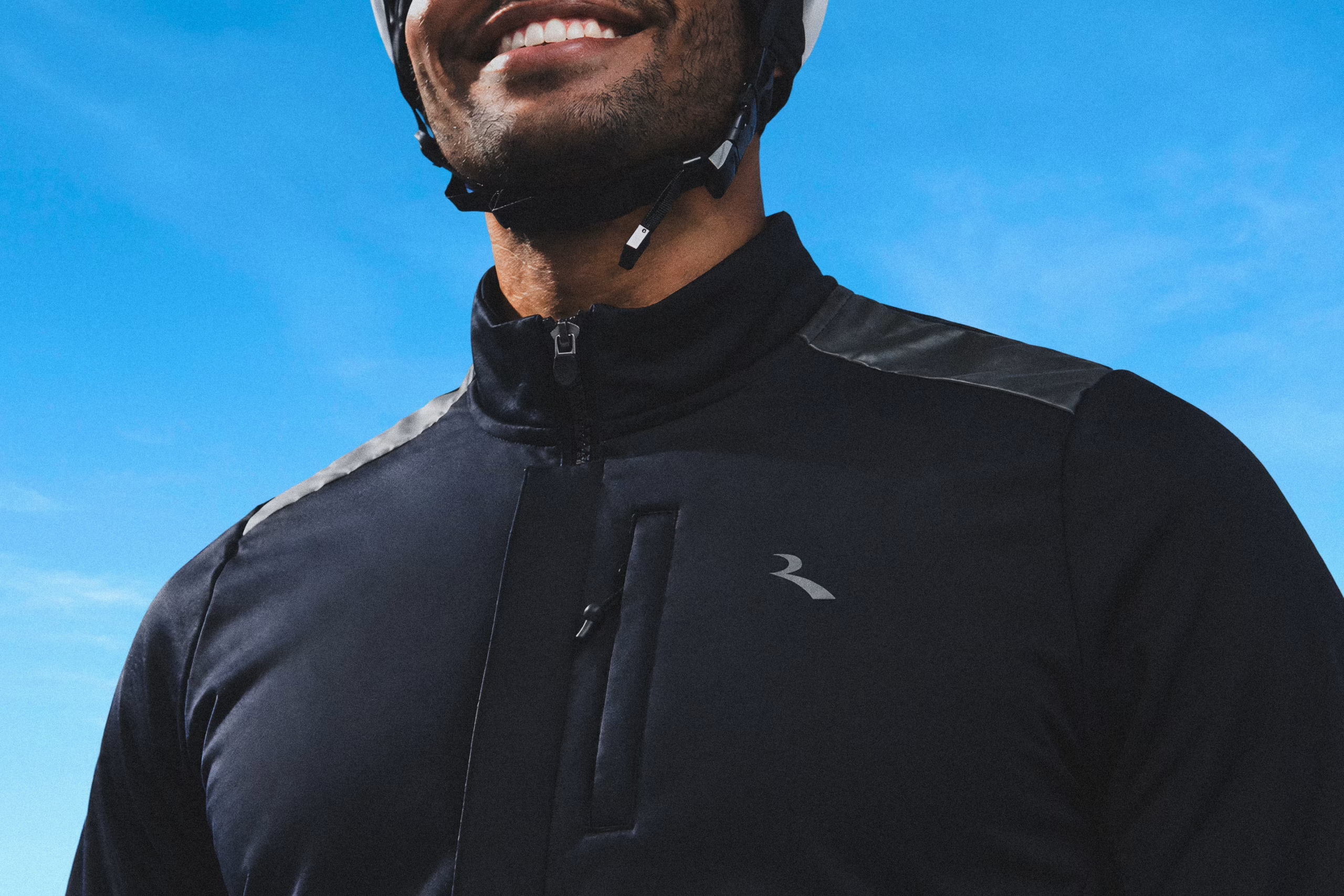
In a cycling category shaped by speed and performance, Rogelli's position is built around the enjoyment of riding. Enjoy the Distance captures that idea in one clear premise: cycling is about the experience of the ride, whatever your pace, distance or level.
Accessibility becomes the foundation of the brand. Friendly, optimistic and open to every rider, Enjoy the Distance gives Rogelli one distinctive idea to build the brand around as it continues to grow.
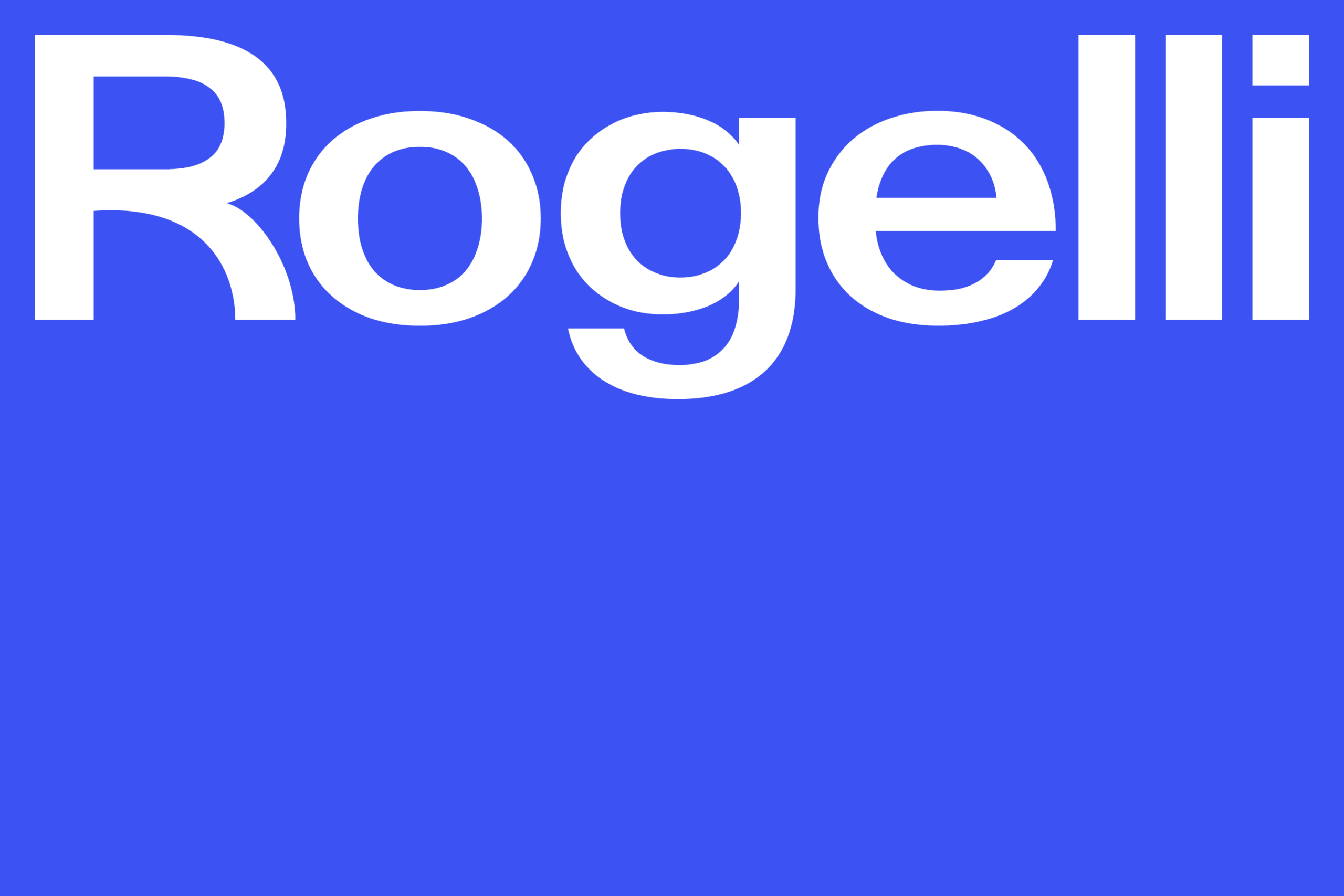
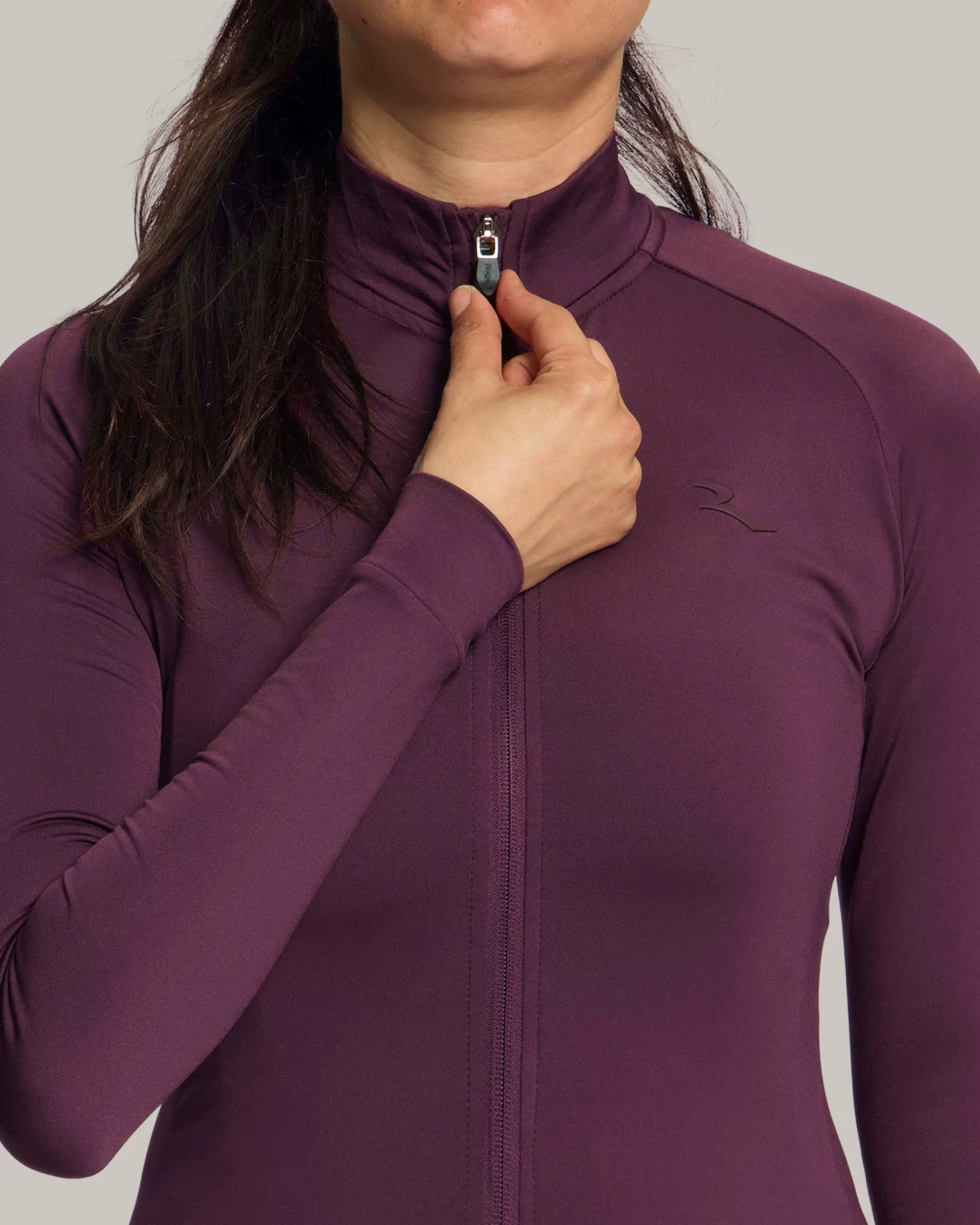
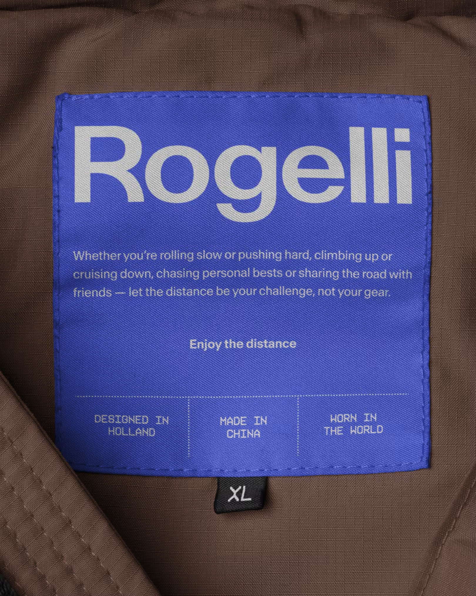
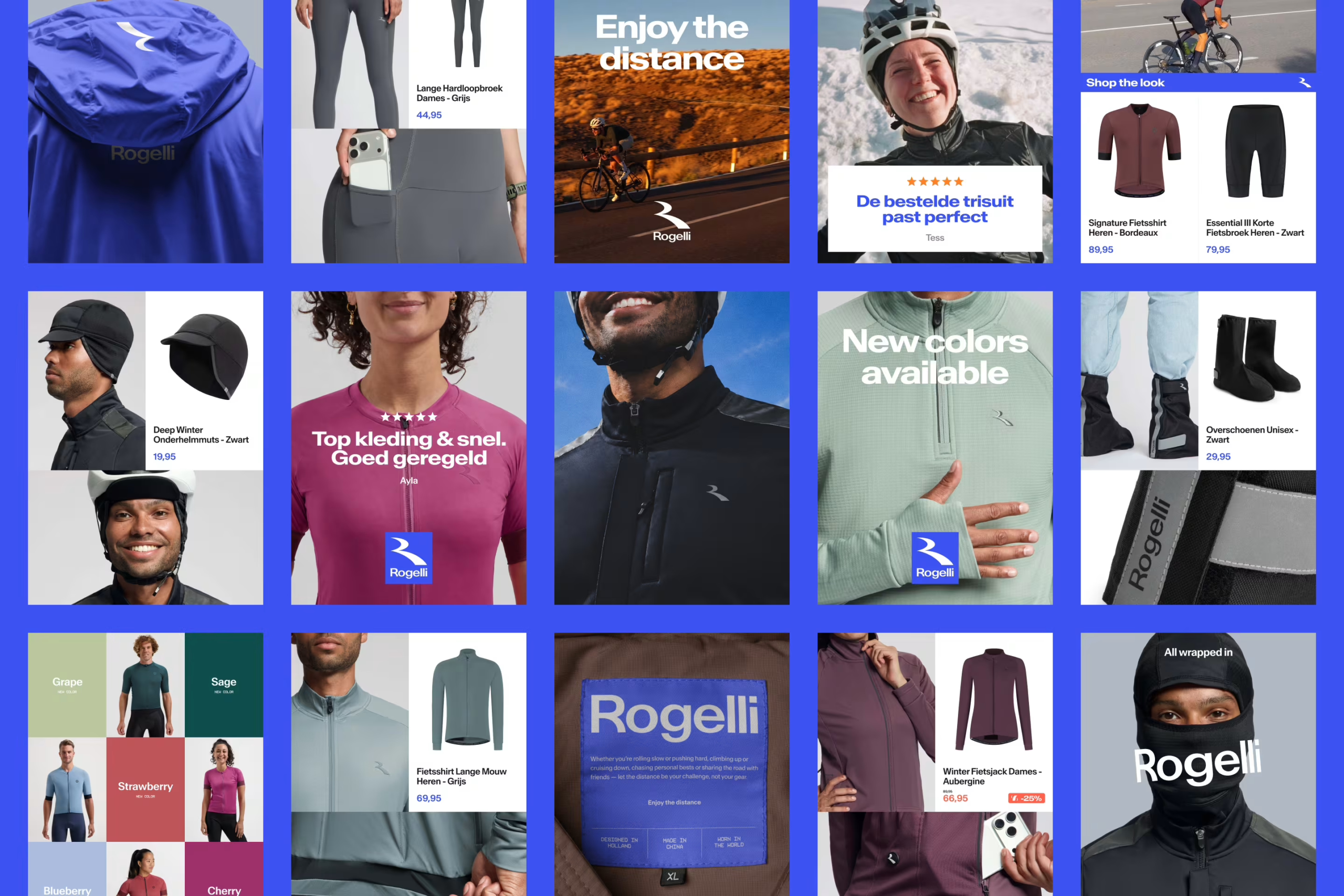
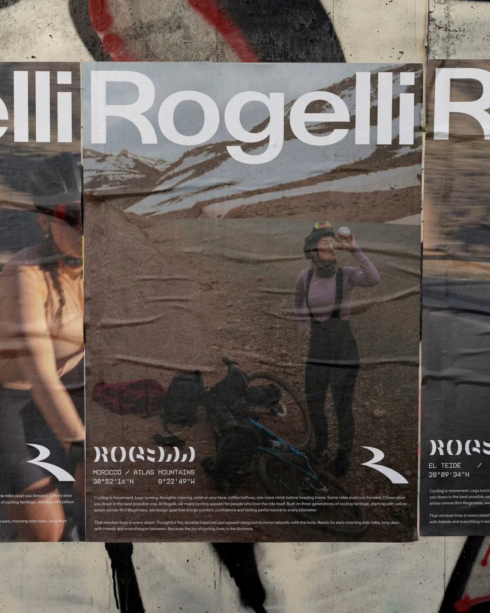
Where the brand once carried many different expressions of its logo, the strategy is translated into a simpler visual core: one distinctive icon and one custom drawn wordmark.
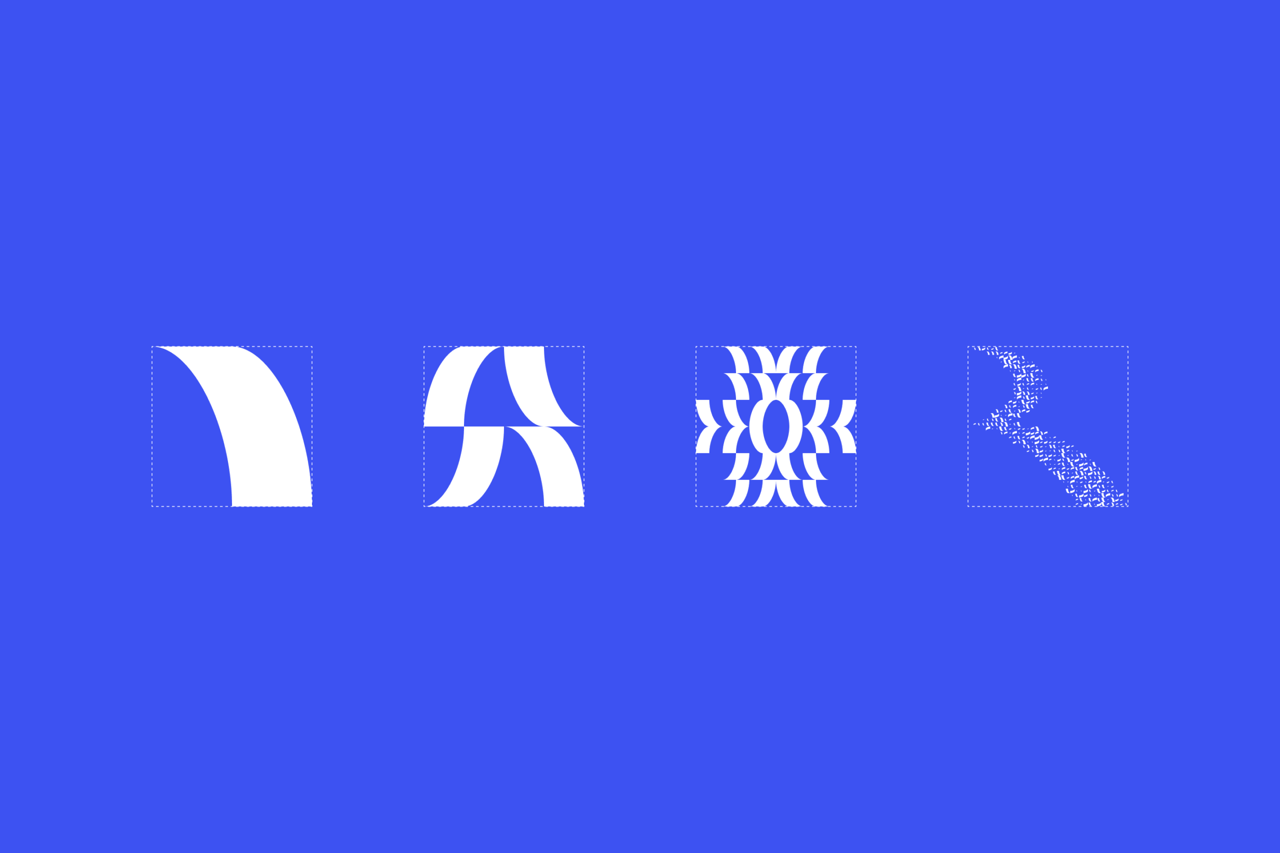
Inspired by the road ahead, the icon's continuous curves express movement, direction and distance while giving Rogelli an open and approachable character. It can stand on its own or extend through rotation and repetition, becoming a continuous graphic element in motion.
The custom wordmark carries the same open and rounded character, giving Rogelli a clear signature. Together, both elements form a flexible system that works across product, retail, digital and communication.
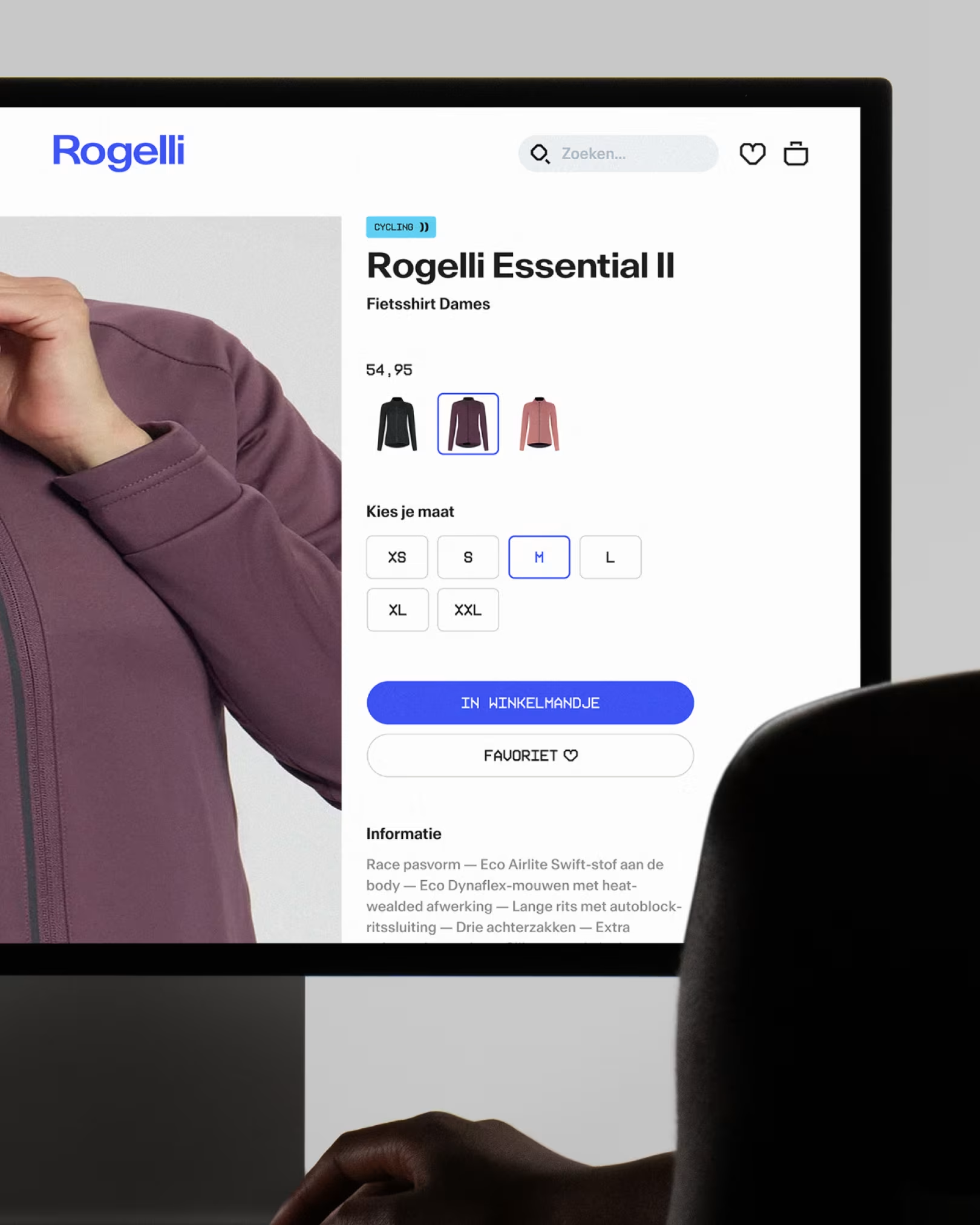
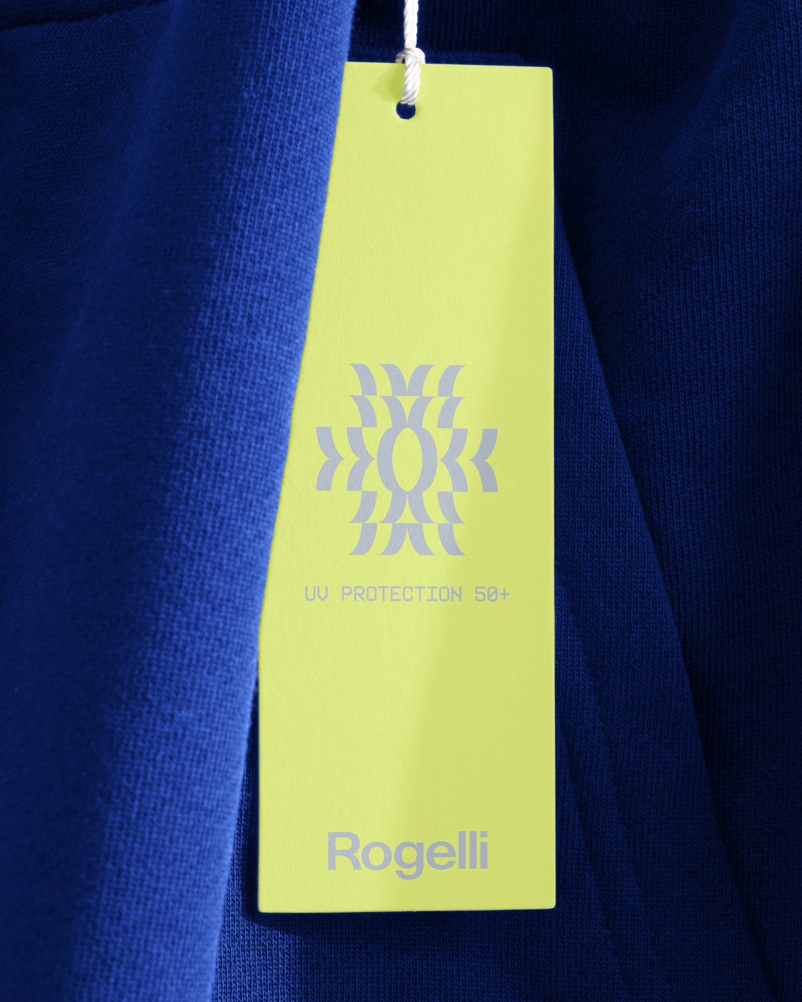
Blue is an established part of Rogelli's recognition. The colour was intensified into a brighter, more active tone, with a refreshed palette built around it to create greater range across product, campaigns and digital applications.
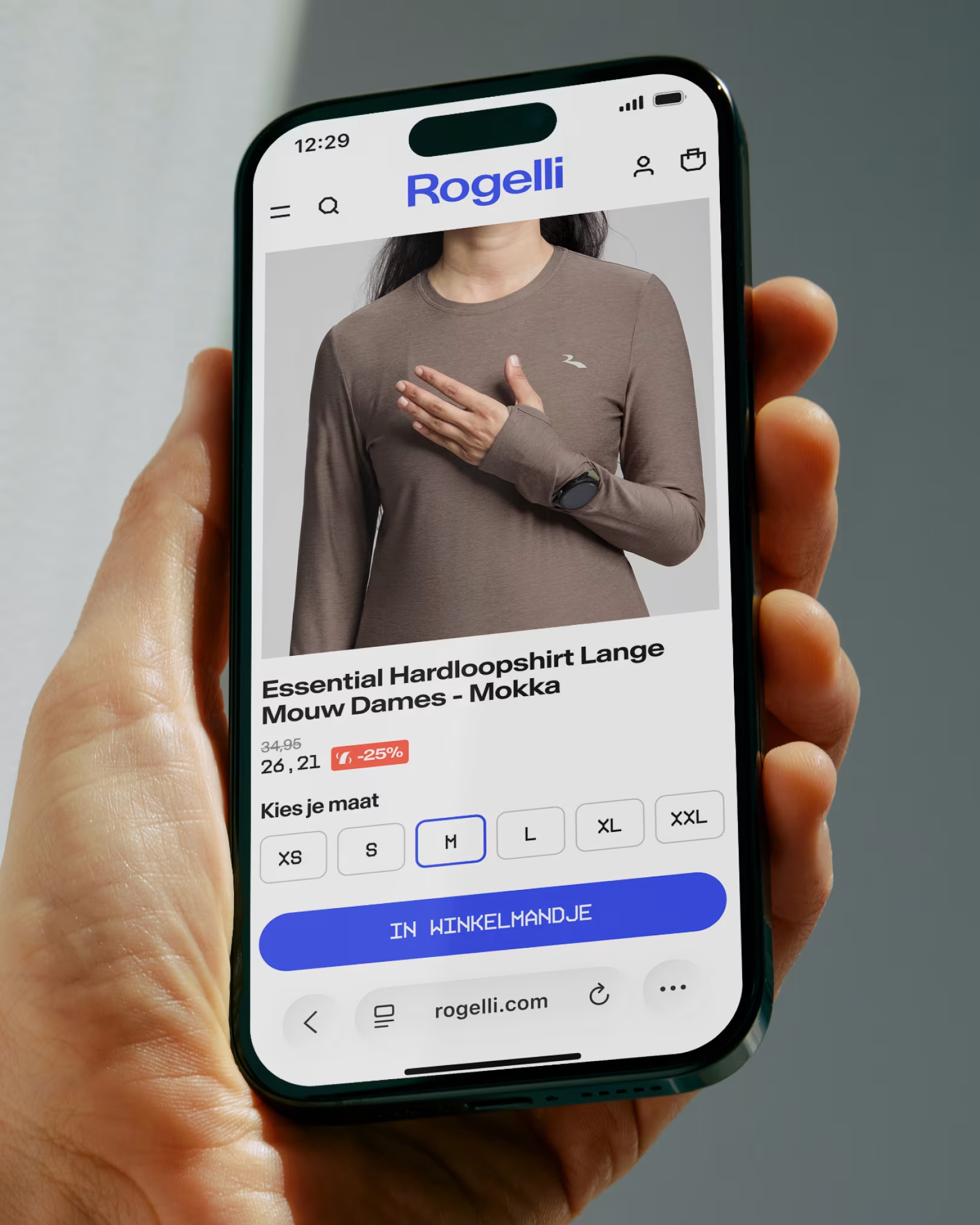
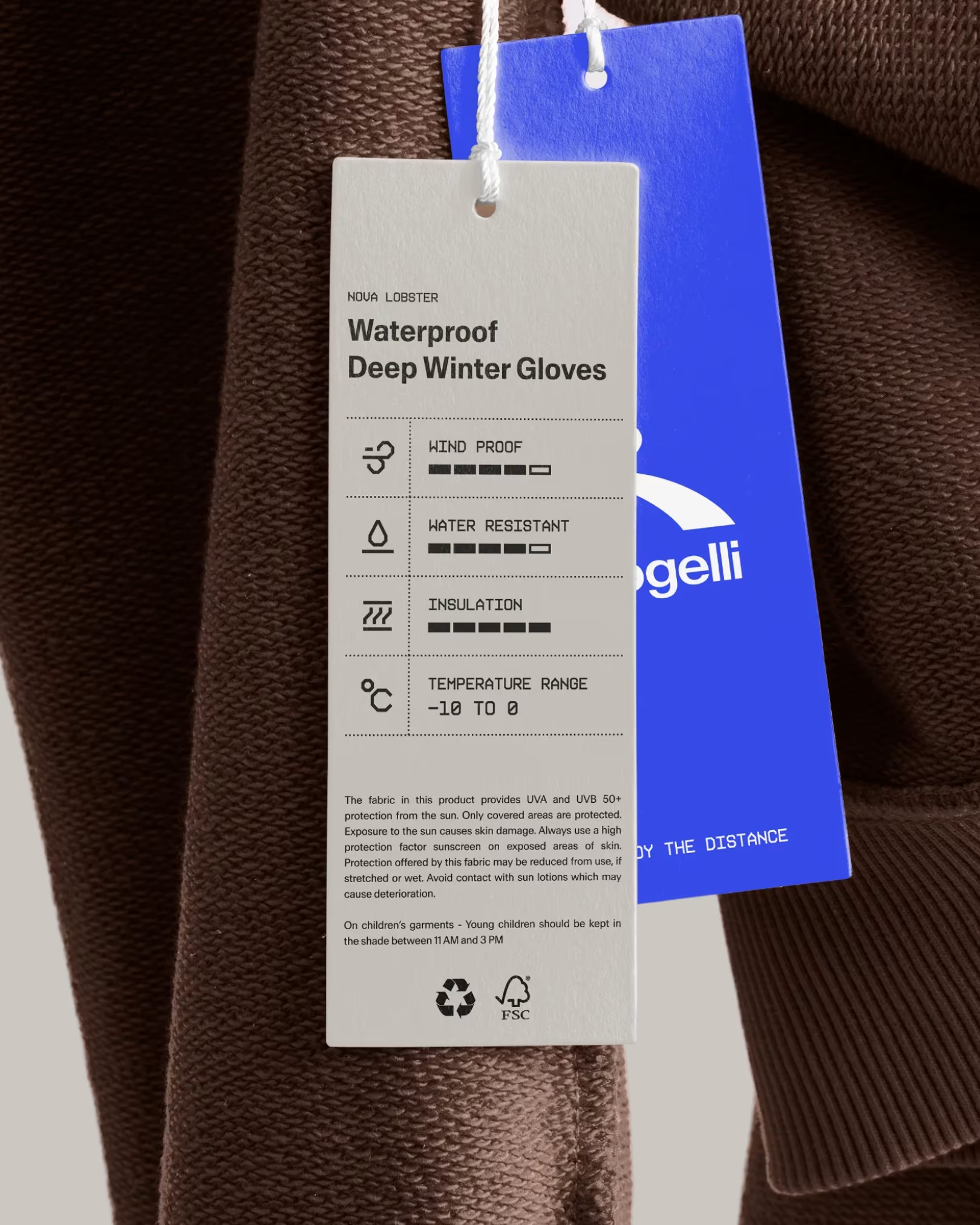
Antarctica by Newglyph gives the brand a flexible typographic voice through its variable widths and weights, structured around a set of recognisable presets. KH Interference by Kurppa Hosk brings precision to product specifications and technical information. Its angular language also forms the basis of a custom library of more than 100 icons, connecting product features, packaging and ecommerce functions such as search, basket and navigation within one consistent visual system.
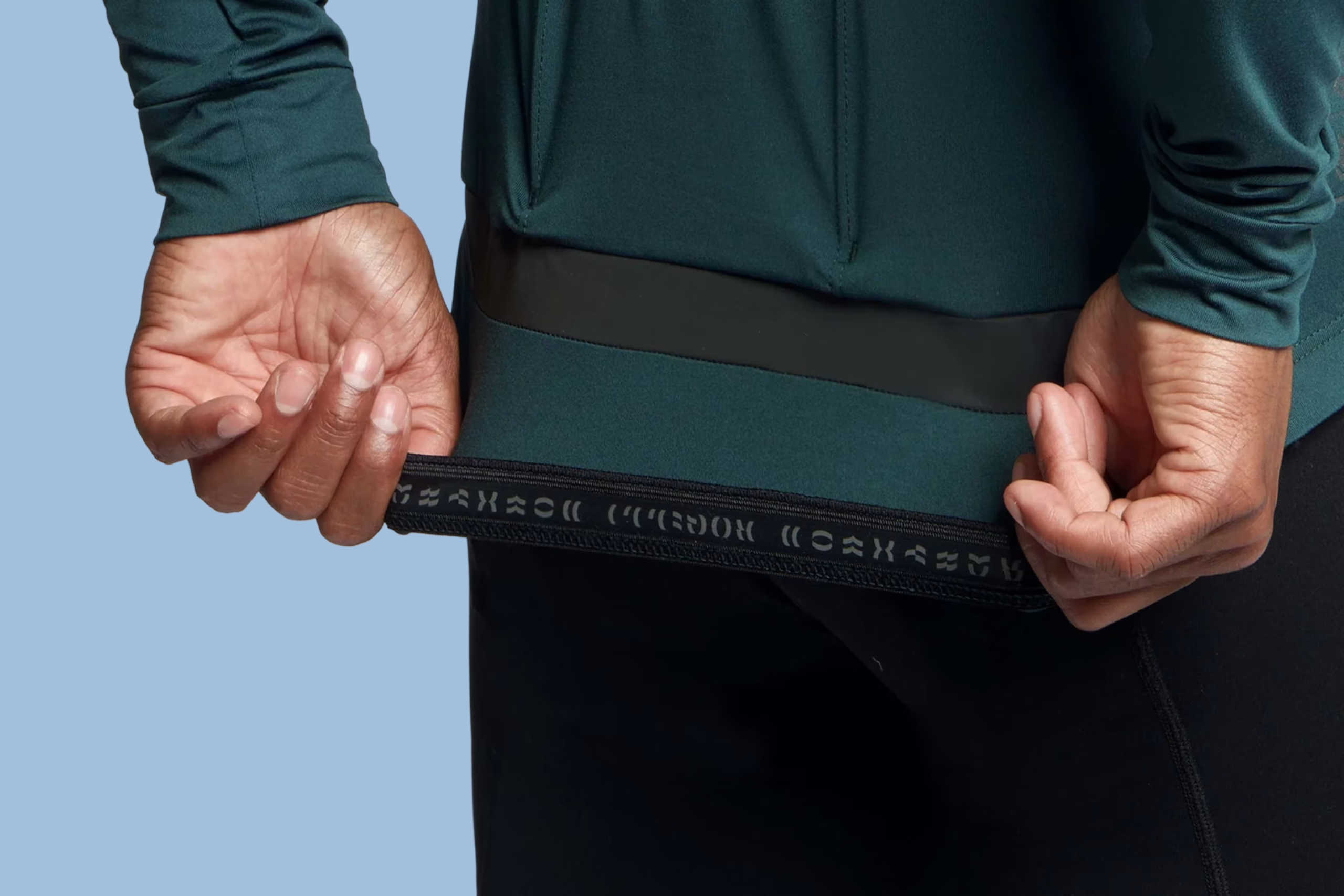
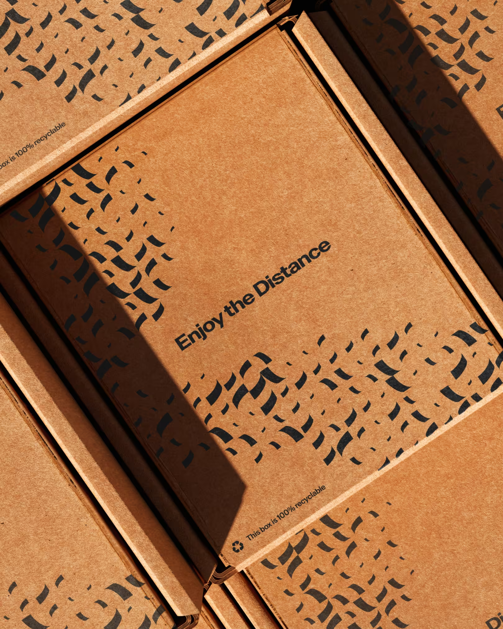
Rogelli Road Parts™ is a modular graphic system that gives Rogelli a flexible way to build shapes, symbols and patterns from one simple element. Derived from a detail in the Rogelli R, the square unit can be repeated, rotated and connected in multiple directions. From that single shape, new forms can emerge, from icons and objects to letters, words and large scale patterns. The result is a graphic language that can constantly evolve while remaining recognisably Rogelli.
Together, these visual components reflect what Rogelli stands for: accessibility, experience, timelessness and the joy of riding. A solid visual foundation, built for recognition and flexibility, wherever the brand moves next.
Client
Rogelli
Strategy
Anna van den Bijgaart
Typography
Antarctica
KH Interference