
Eventix (now Weeztix)
Brand identity
Digital design
Art direction
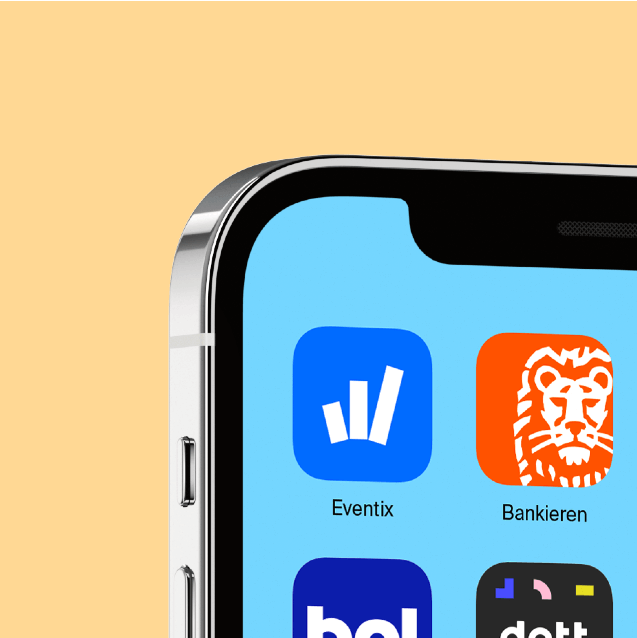
Weeztix (before Eventix) has been building a versatile ticket platform for years and is ready to conquer the world. To help them do so, we created a new brand identity. One that shows Weeztix’ daring and flexible nature. Making it a perfect platform that facilitates organizers where needed.
Weeztix is a partner you can literally build on. You know which event you want to organize - Weeztix helps you build your event shop and sell all your tickets. Weeztix. Build your crowd.
From the idea of 'Build Your Crowd' the icon 'The Cheer' evolved, a steady growth and reflection of celebration. This principle was also translated into typography, using Right Grotesk that has the abilitity the go flex and grow or squeeze in.
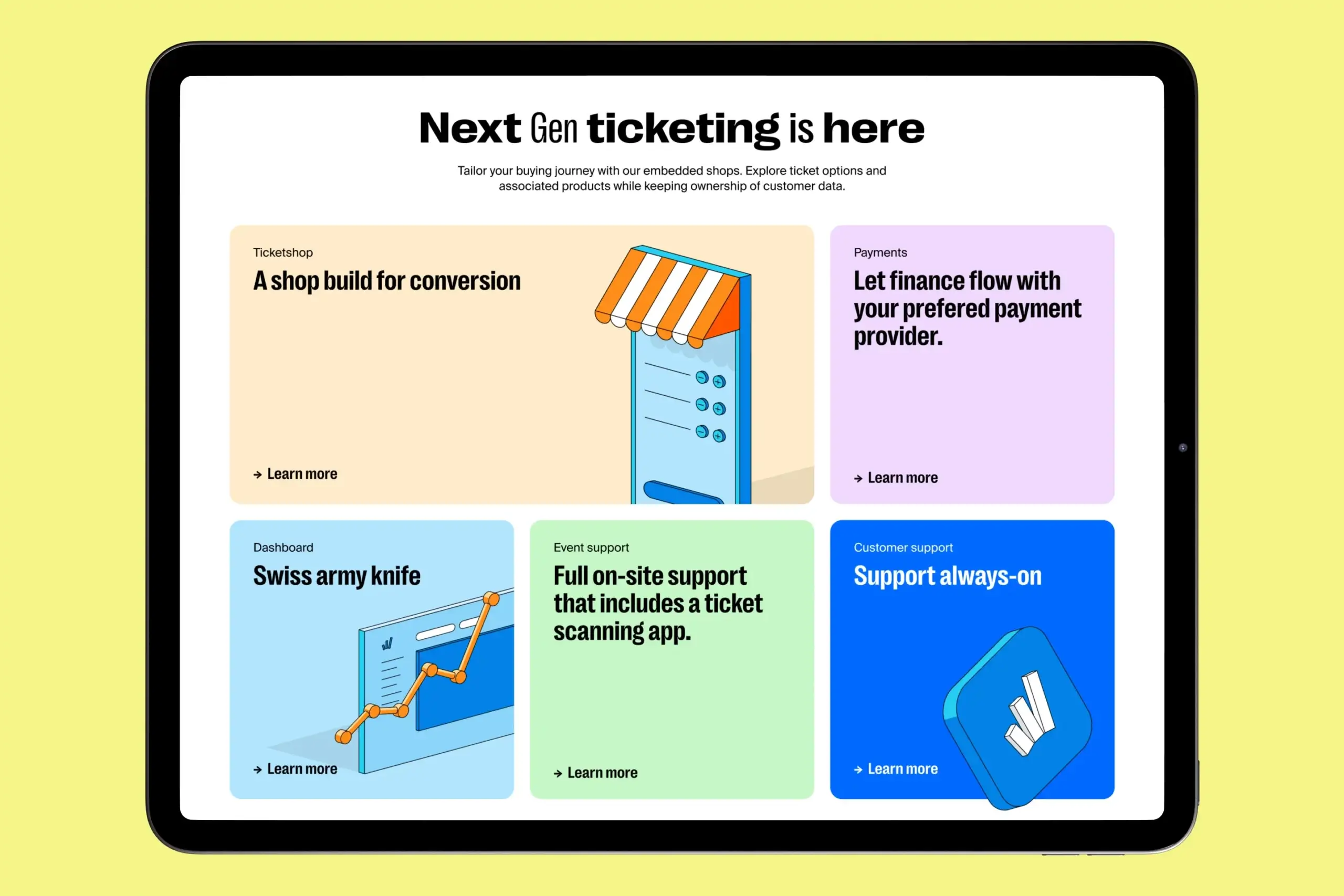
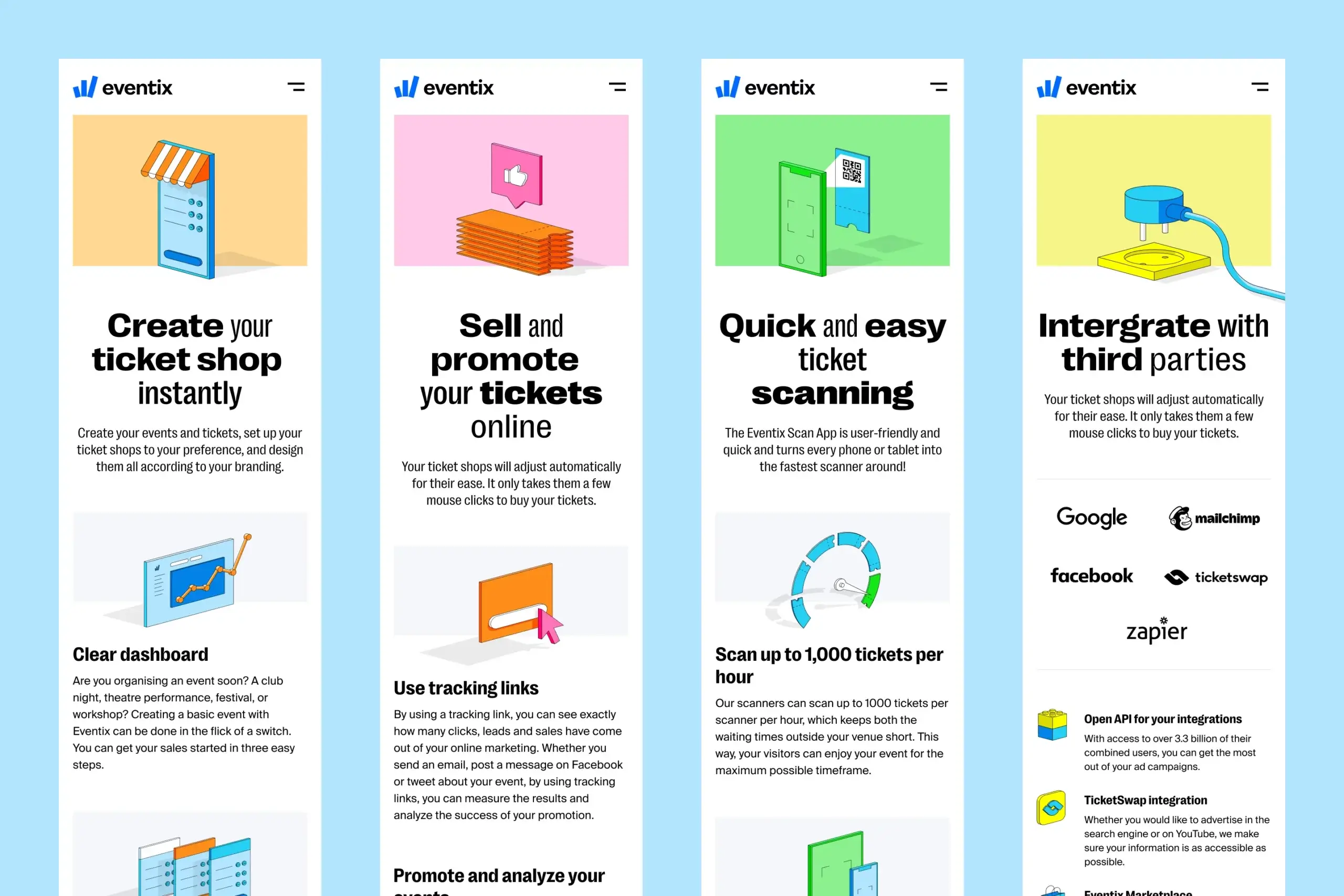
With a wide range of possibilities on the Weeztix platform, event managers can truly pick anything they want or need for a succesfull event. This huge range of options is translated into the design as the candy store for event managers. Thus we went full on joy with color and an illustration style that helped Eventix to visualize SaaS features & also dressed to be the language for blog posting. The style has been used by many different illustrators over time, yet remain consistent due to its style and color system.
Client
Weeztix (Eventix at the time)
Agency
Resoluut
Resoluut
Floris de Wit
Jasper Tempel
Rogier Knoops
Campaign
Big Shots
Typography
Right Grotesk
Suisse Int'l