Pomander — A Sense of Place and Time
Client
2022
Brand identity
Design direction
A Resoluut project
Drawing inspiration from the watch’s material and engravings, the Hotel Pomander's logo reflects a modern interpretation of this historical artifact.
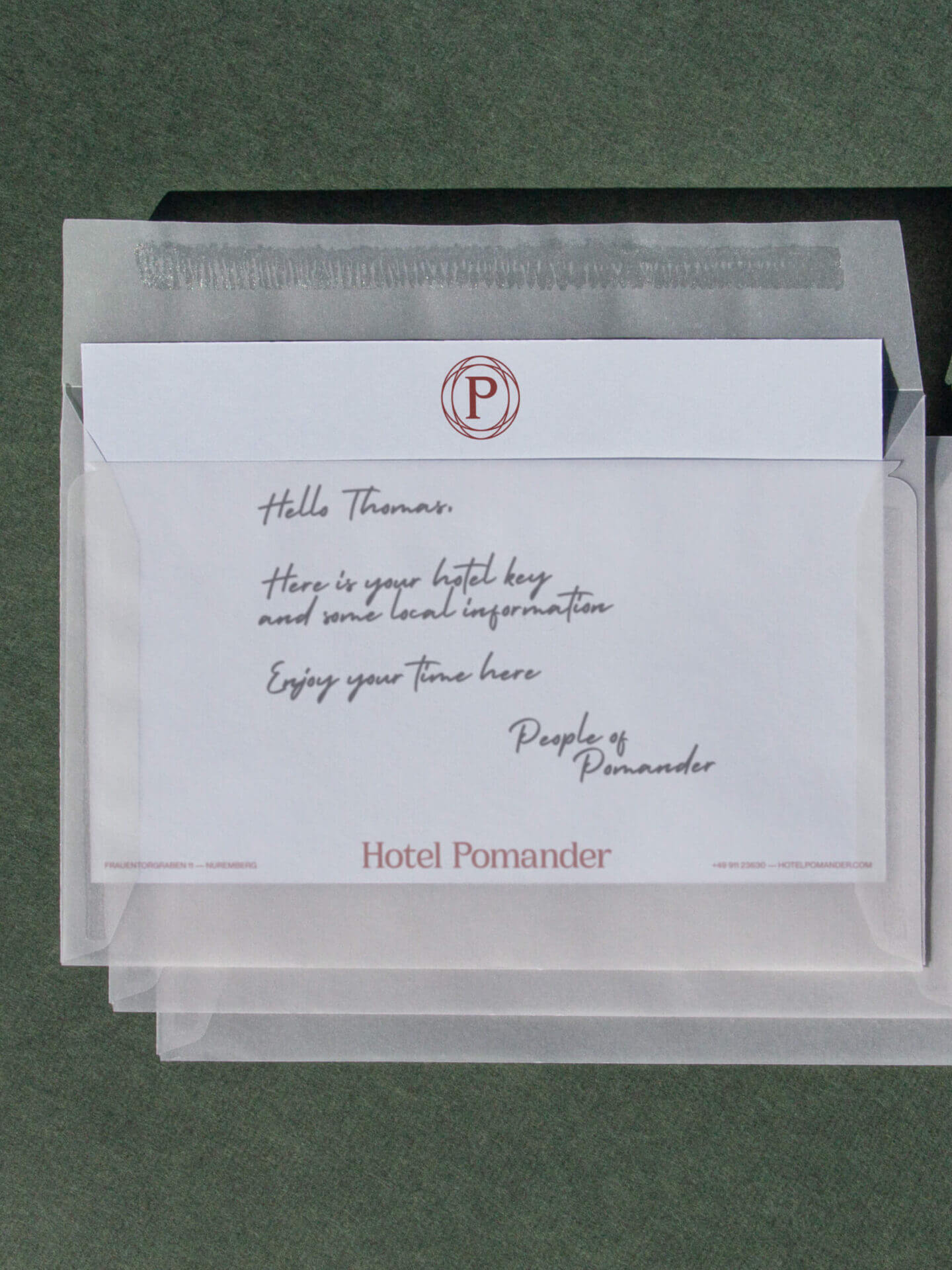
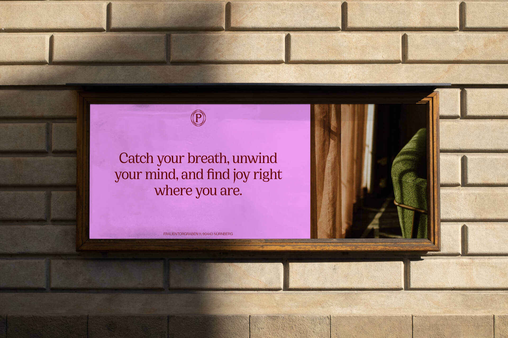
Named after the world’s first watch, Hotel Pomander is a place to unwind. To be in the moment and explore the past. Located in Nuremberg, Germany - where the Pomander watch was invented in 1505 - the hotel explores the city’s rich heritage. Especially how it intertwines with modern life. With time at the base of its new positioning, we brought this new brand fully to life. With a visual identity that connects history with the present moment. Giving its guests experience the unique sides of the city the hotel is located in. Bringing an ode to the remarkable city this hotel is located in.
The Pomander watch
With the Pomander watch Nuremberg has transformed how we experience time. Making it portable and even tangible. Pomander’s brand feels authentic and delves deep into the rich heritage of the city, with a visual identity that follows the curvature of the Pomander watch. Drawing inspiration from the watch’s material and engravings, the Hotel Pomander's logo reflects a modern interpretation of this historical artifact. Setting the brand into a new era. The brand balances serenity and vibrance, embracing its key values, Calm, Lively, and Casual. Offering its guests a calming oase with plenty to discover.
The passing of time
The brand's copper and bronze tones, influenced by the metals used in the Pomander Watch, refer to the city's raw material history. Giving Hotel Pomander its signature warm feel. These warm and deep tones are combined with bright colours, representing the expression of the seasons and adding accents to set different moods. Its custom made display font Cirka Pomander brings elegance and a sense of time and place to the brand. A modern take on the gothic original typography, crafted in Germany in the 15th century. Combined with a neutral and highly accessible body font to contrast its strong character. With the interplay of light and shadow, the brand's photography showcases the passing of time.
The past converges seamlessly with the present at Hotel Pomander. From its website and lobby to its stationery and guest rooms. Hotel Pomander is a place to find time. Inviting visitors to unwind and embrace the moment.


Team
Djoelia van der Velden
Ruben Staps
Tobias van Geijn
Typefaces
Cirka Pomander and Neue Montreal — PangramPangram