
Simyo
Brand identity
Art direction
For years, Simyo has been one of The Netherlands’ most appreciated mobile providers. Friendly, approachable and uncomplicated. But as the brand strategy evolved, the visual identity no longer matched its ambitions.
Together with the Simyo team, we repositioned the brand around simplicity, quality and customer service. Less noise, fewer choices and more focus on what truly matters. The challenge was to create a stronger commercial presence within the budget telecom landscape, without losing the warmth people associate with Simyo.
From the start, teams across the company were closely involved in the process. Through recurring feedback loops and validation moments, the new direction was shaped collaboratively and embraced internally from day one.
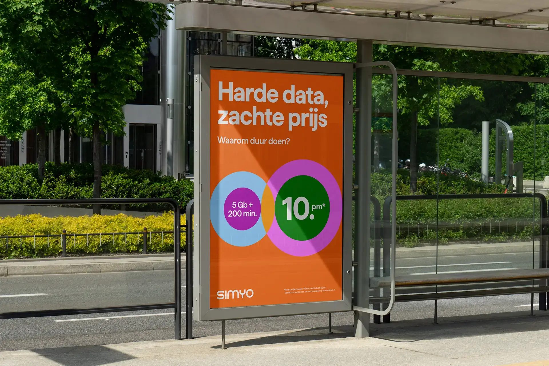
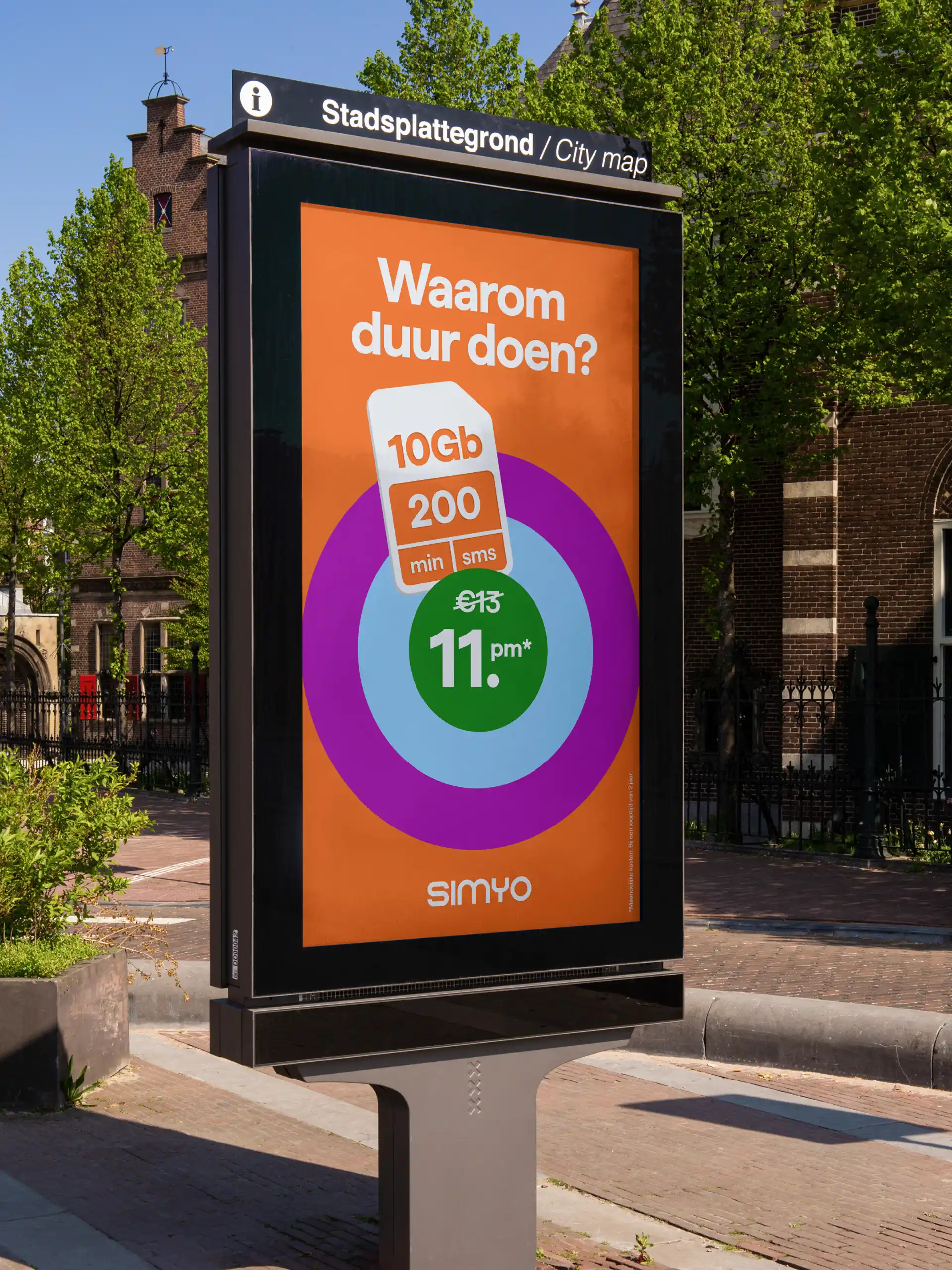
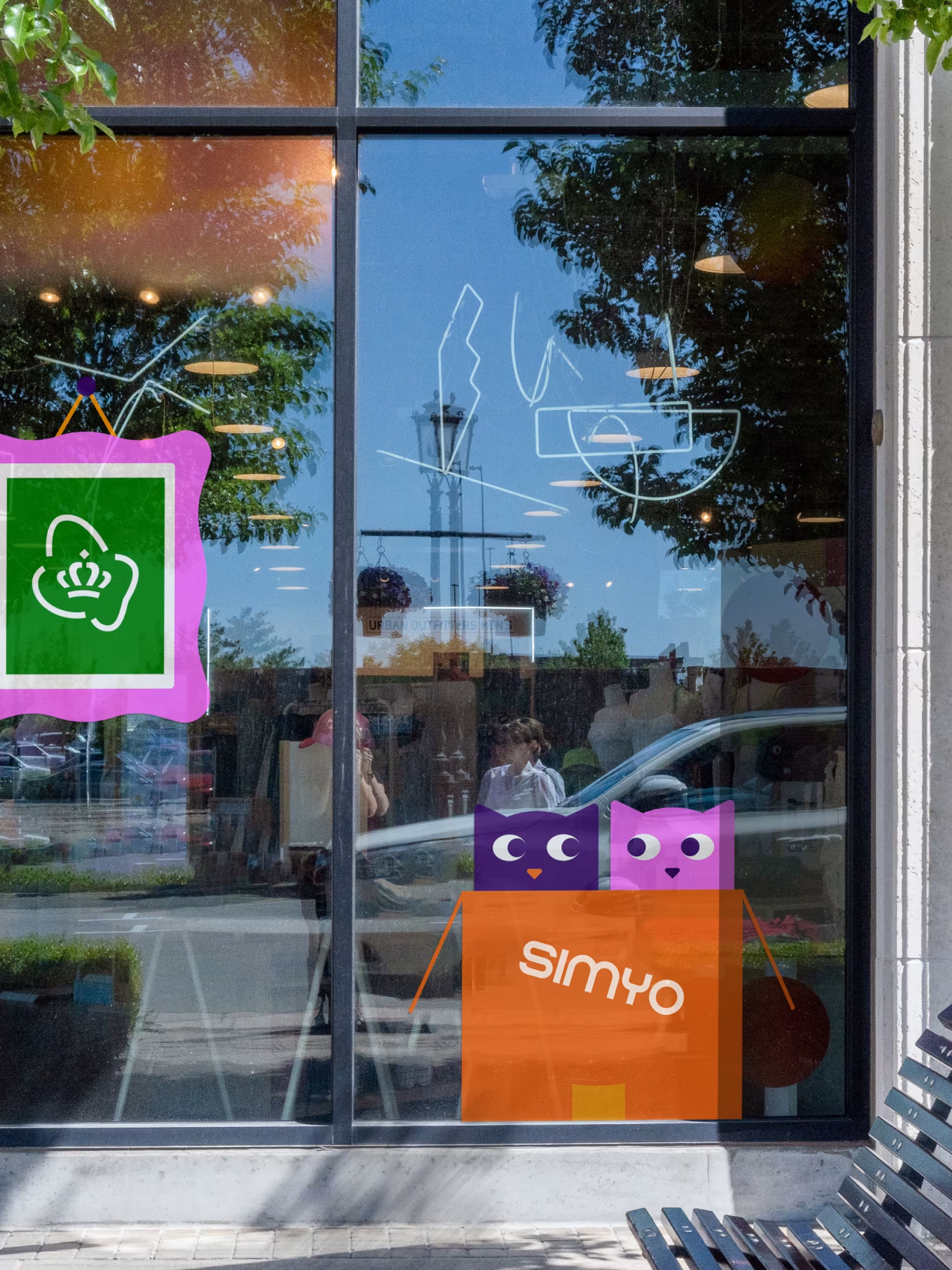
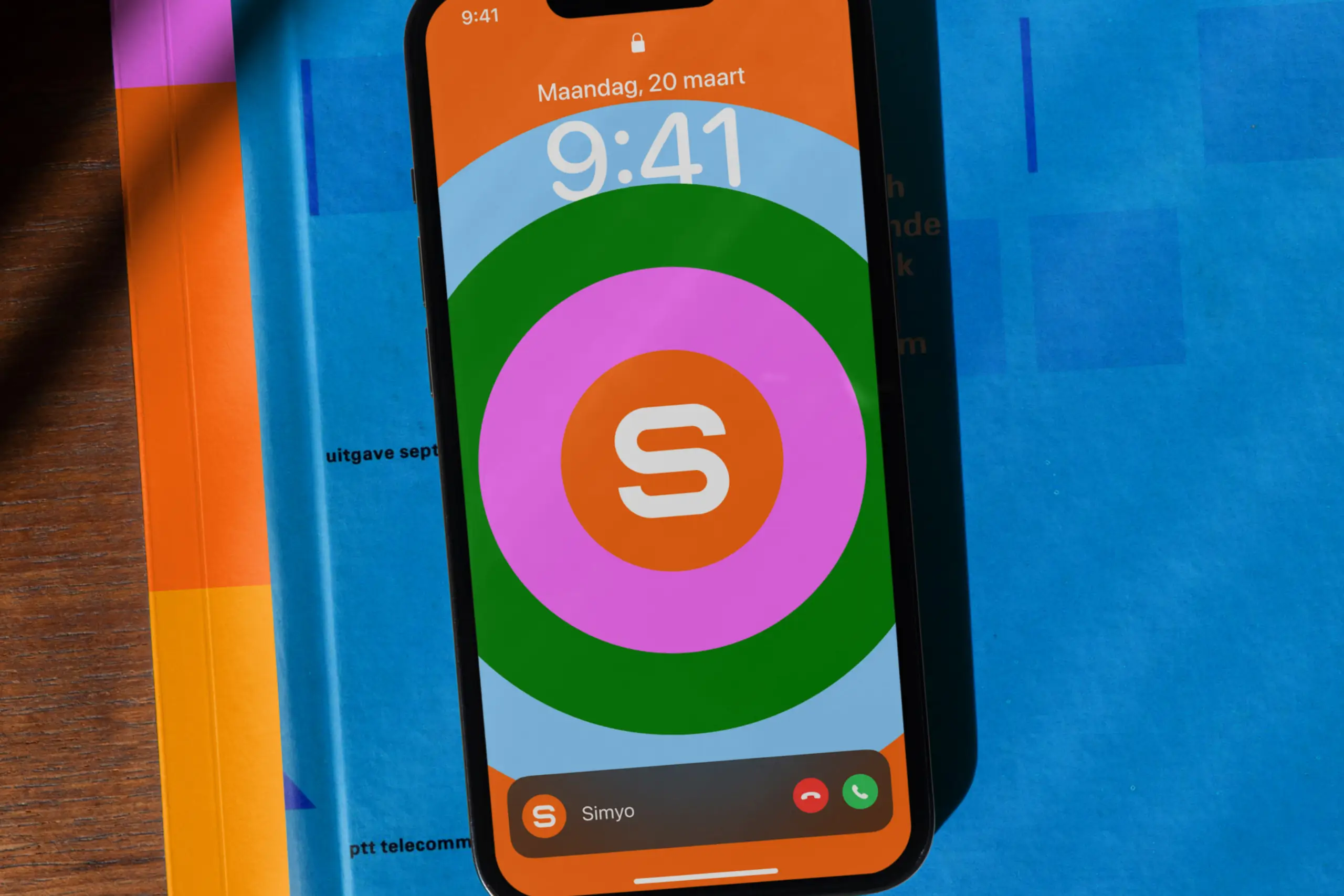
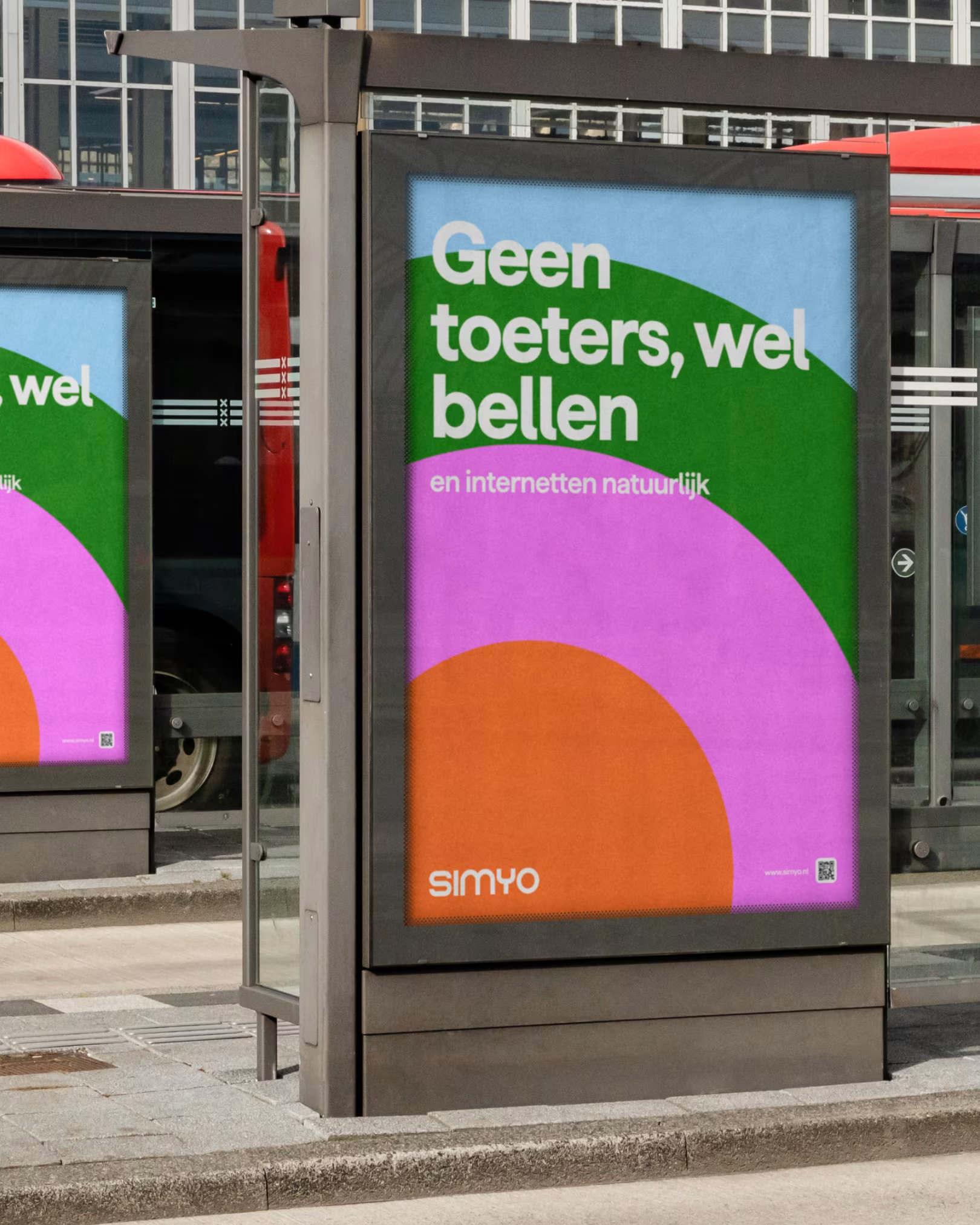
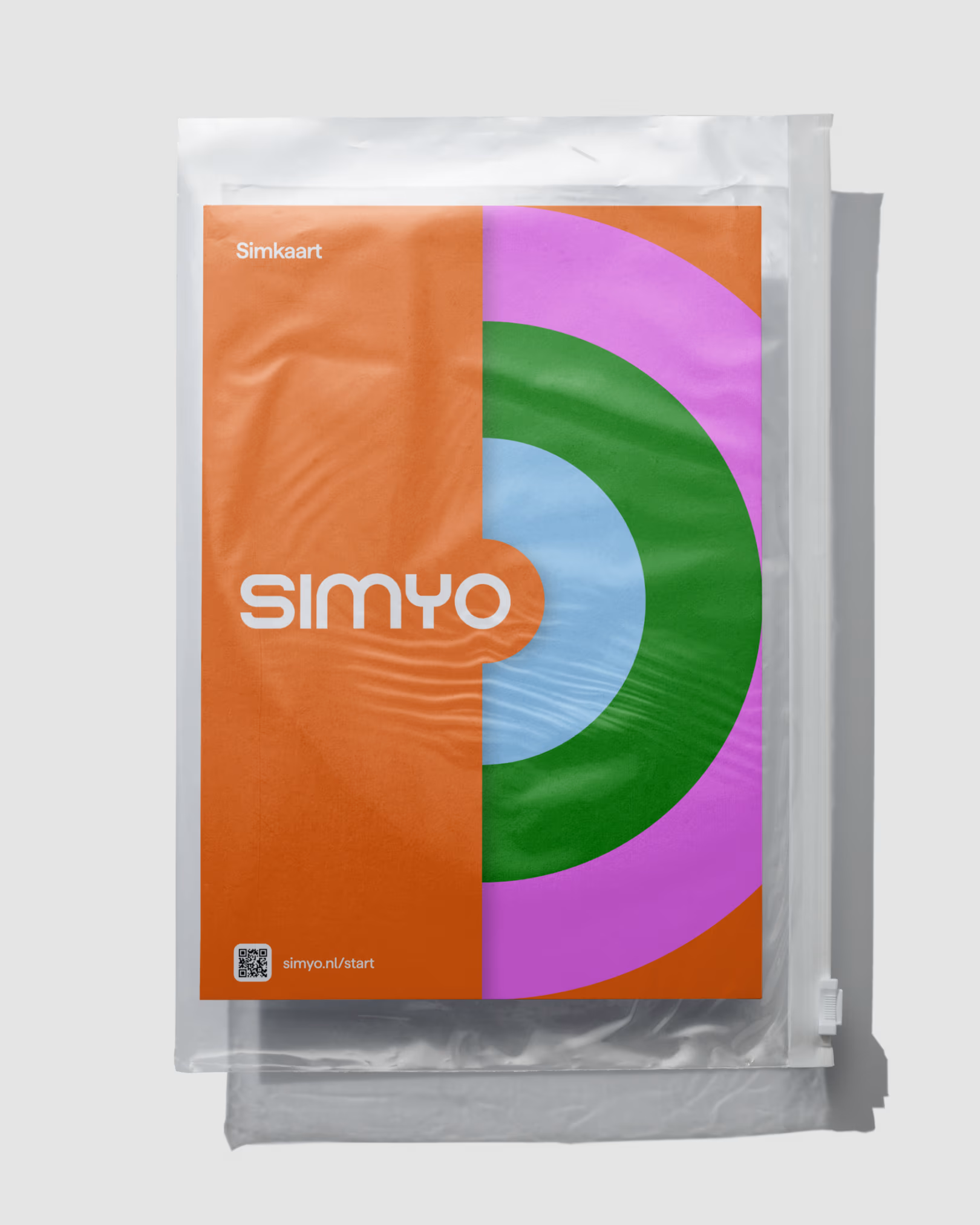
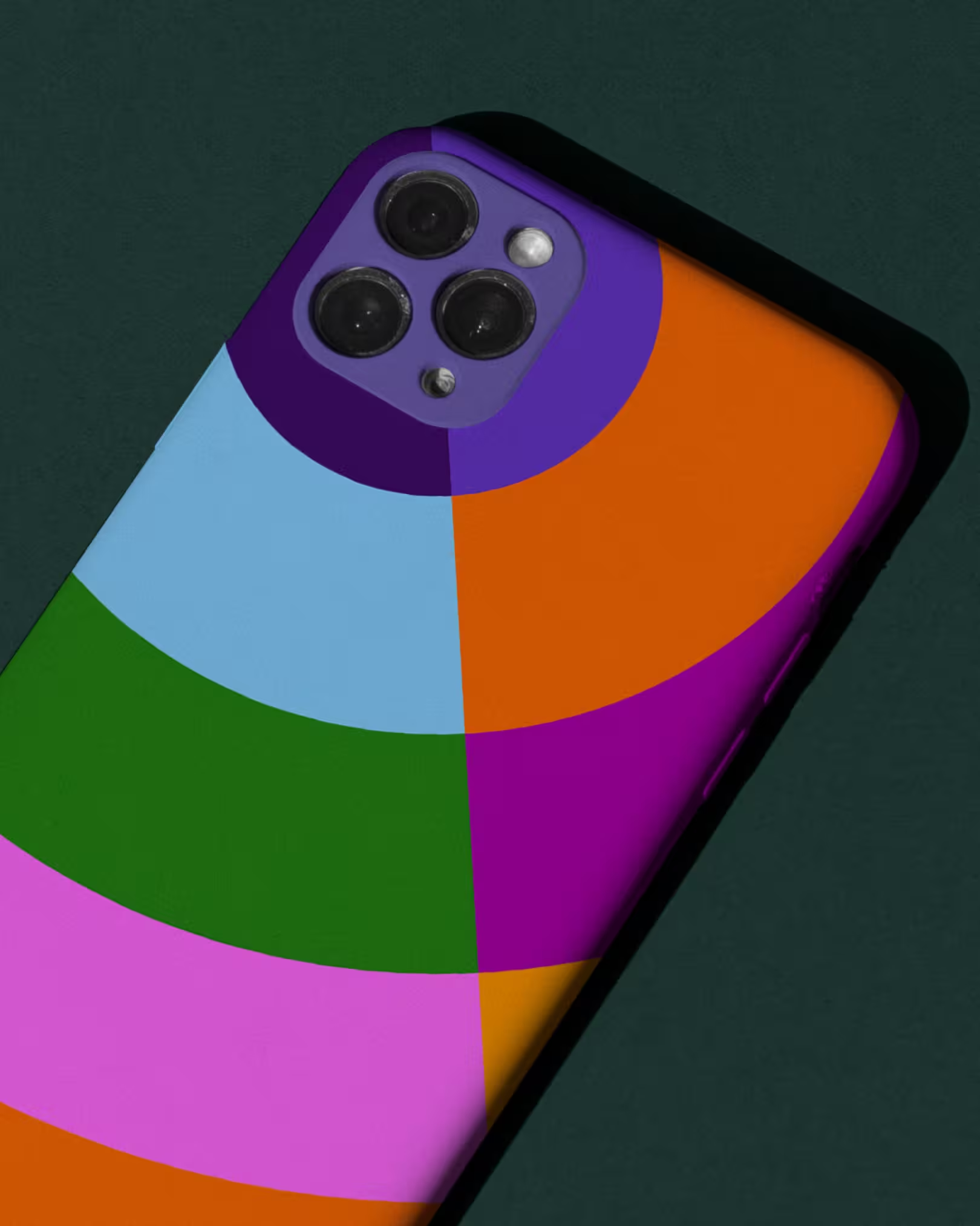
The new identity is built around the idea of the Core. Inspired by the circular compositions of Karel Martens, it translates connectivity into a bold and flexible visual system.
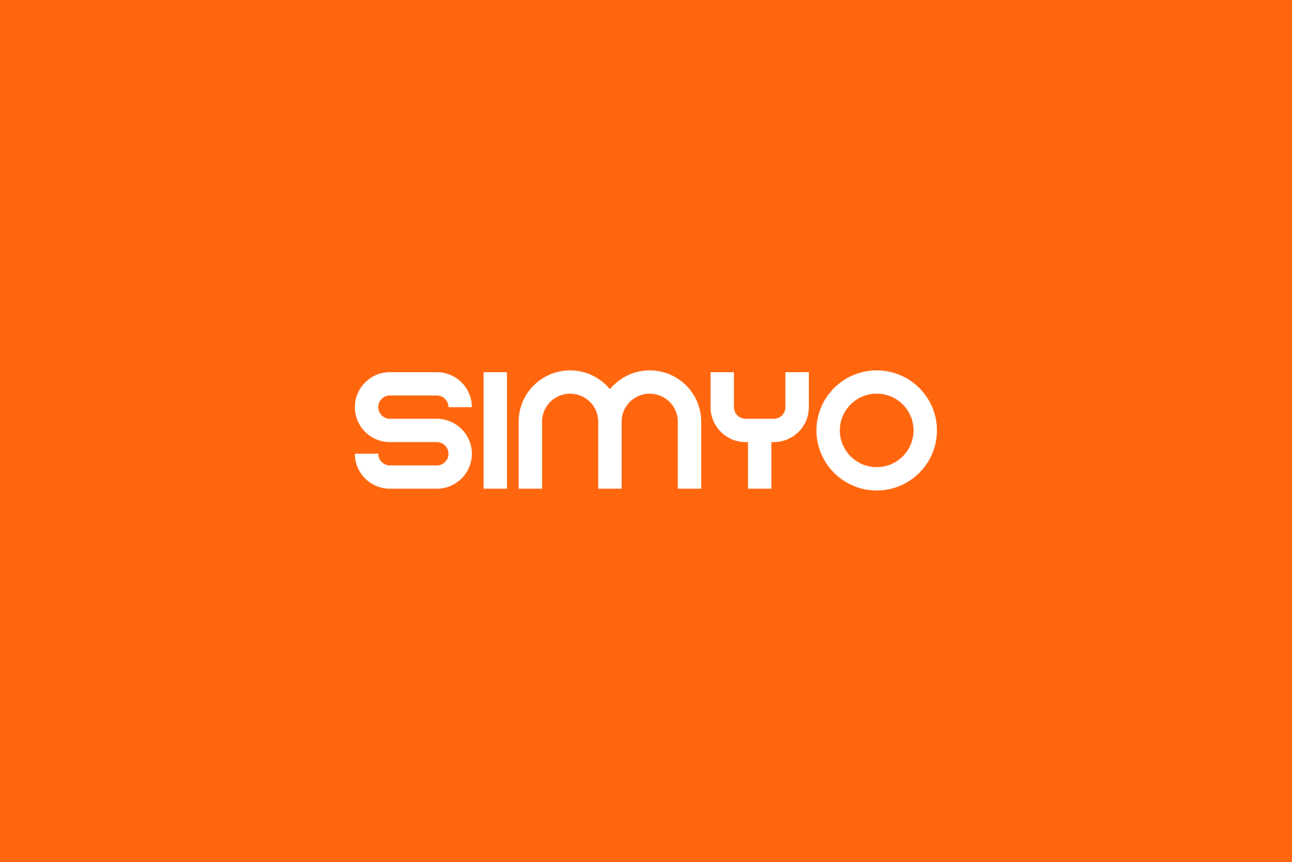
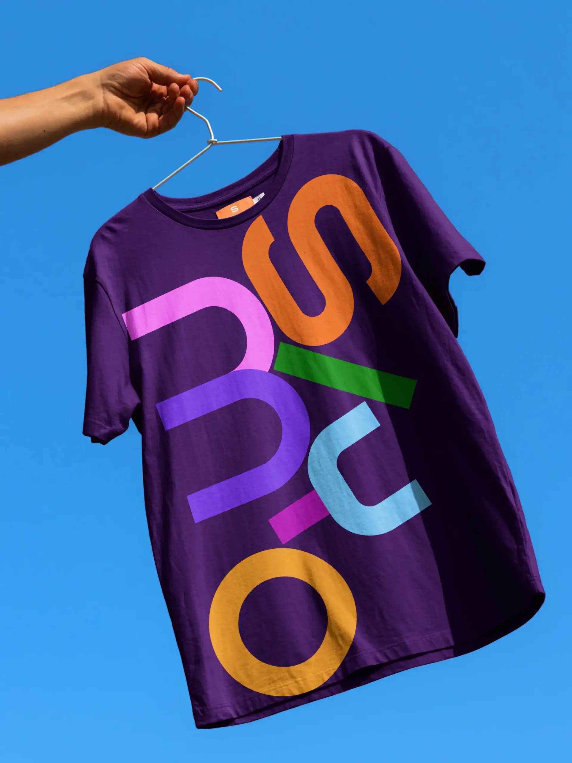
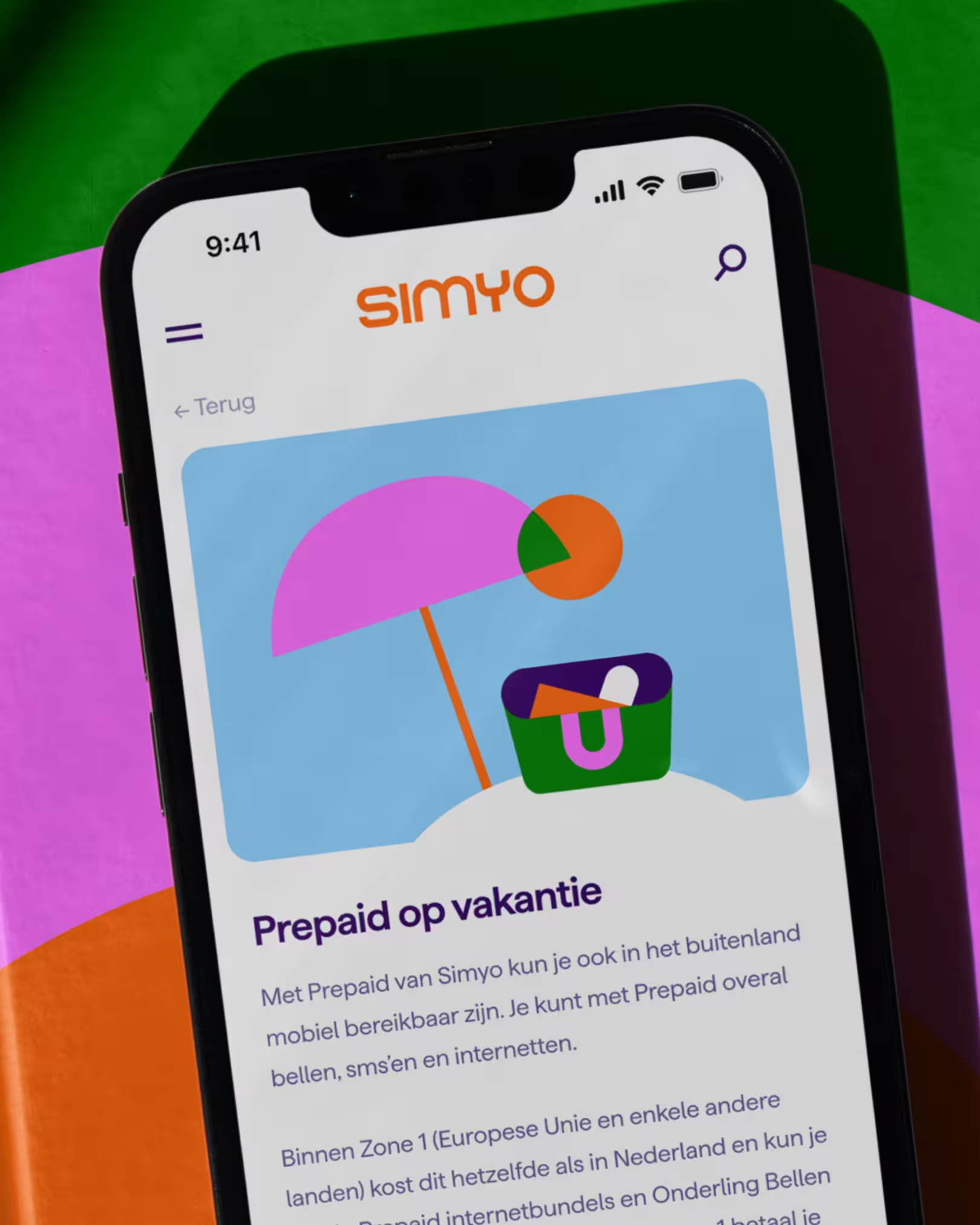
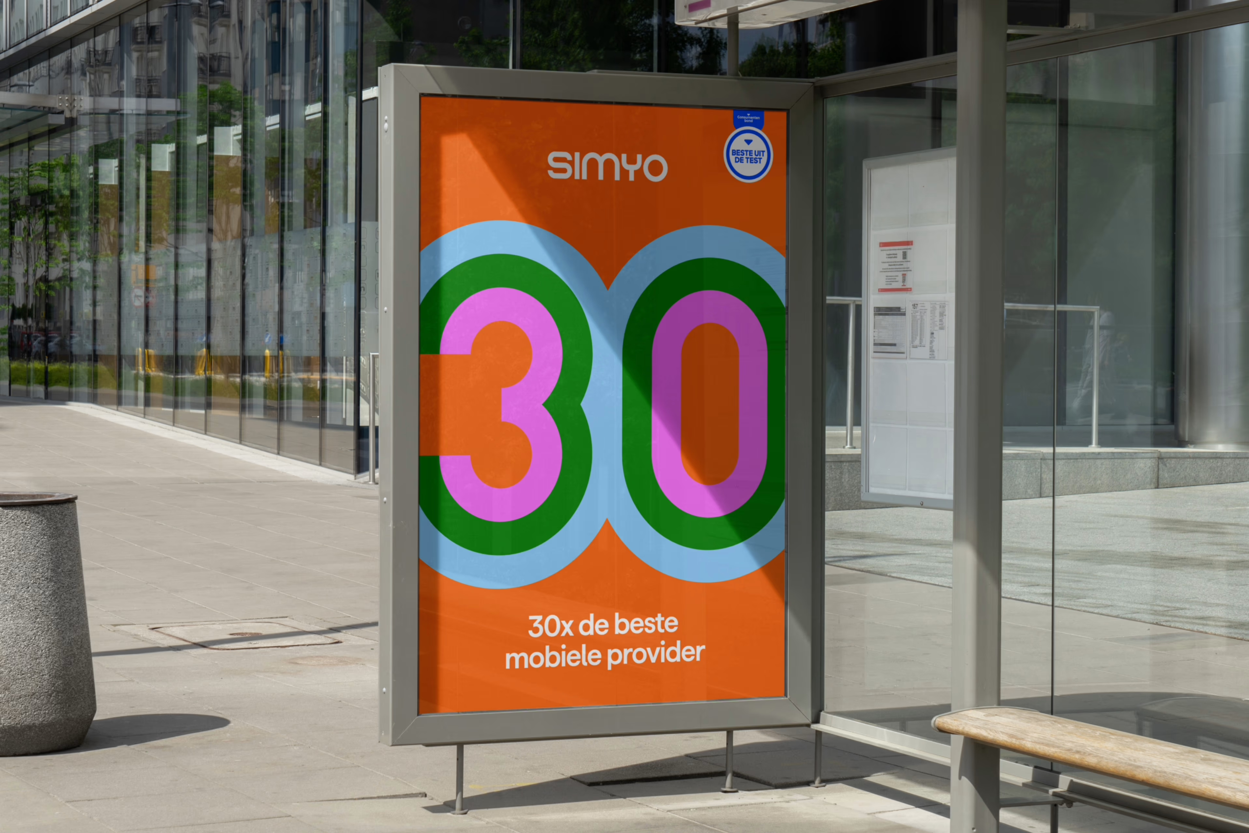
At the center sits Simyo’s recognizable orange, expanded with a broader palette for more distinction and commercial impact. The logo was simplified and strengthened while staying true to its original character. Combined with the Haffer typeface, the identity balances clarity with warmth.
Designed as a flexible system, the Core adapts naturally across campaigns, digital products and brand communication. To bring the identity into the organization, we also supported the internal launch through workshops, branded applications and hands-on sessions with teams across Simyo.
Client
Simyo
Agency
Resoluut
Resoluut
Anna van den Bijgaart
Björn van Ginkel
Jasper Tempel
Rogier Knoops
Ruben Staps
Campaign
Joe Public
Digital design
Saxxum
Typography
Haffer