Logo index
Superimpose Architecture
Superimpose

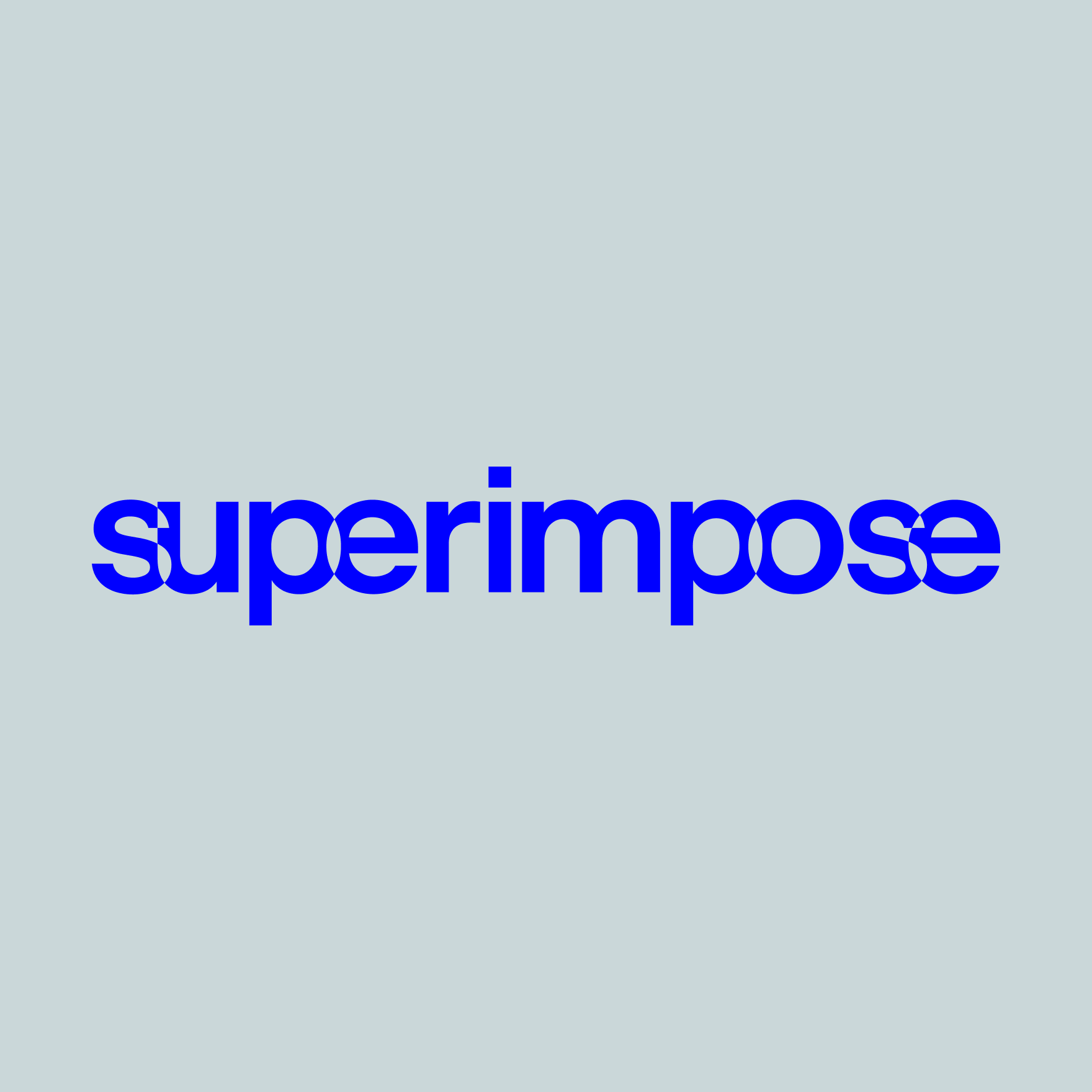
Architecture firm Superimpose is one that adds value by removing. It keeps the essence of a place, it builts on what is needed.
By using the word superimpose in visual translation, overlapping letters blend in one another. It can move or just as is. Nothing more.
Based on Beausite Classic, Semibold with custom kerning and exclusion. Designed at Resoluut.
Tramhuis
Around the Corner

Based on the contours of the Tramhuis building, that functions as a corner stone location where visitors start their Rotterdam city walk.
The Tramhuis logo represents movement, the tracks of the city. It can be used in multiple angles, functioning as a walking route.
Tramhuis uses Lineto's Supreme (Black), with a slightly altered letter A to match in the corner. Designed at Resoluut.
Travolta’s logo is based on the concept of showing you where you can go. It moves you forward, it get’s you and your car towards the best price or deal to charge. The speed and spinning wheels displayed in the icon are an extra detail that help communicating and connecting it towards the industry. Automotive and mobility. Travolta's keeping an eye out.
The character eyes, Danny, can have multiple expressions. This is a way to evoke emotions, that is reconisable for the audience. It thinks, laughs and shows you where to go.
The icon is hand drawn. For the word mark MD Nichrome, Dark Oblique was used with the alternate letter A. Designed at Resoluut.
JobTraining
Learning Path

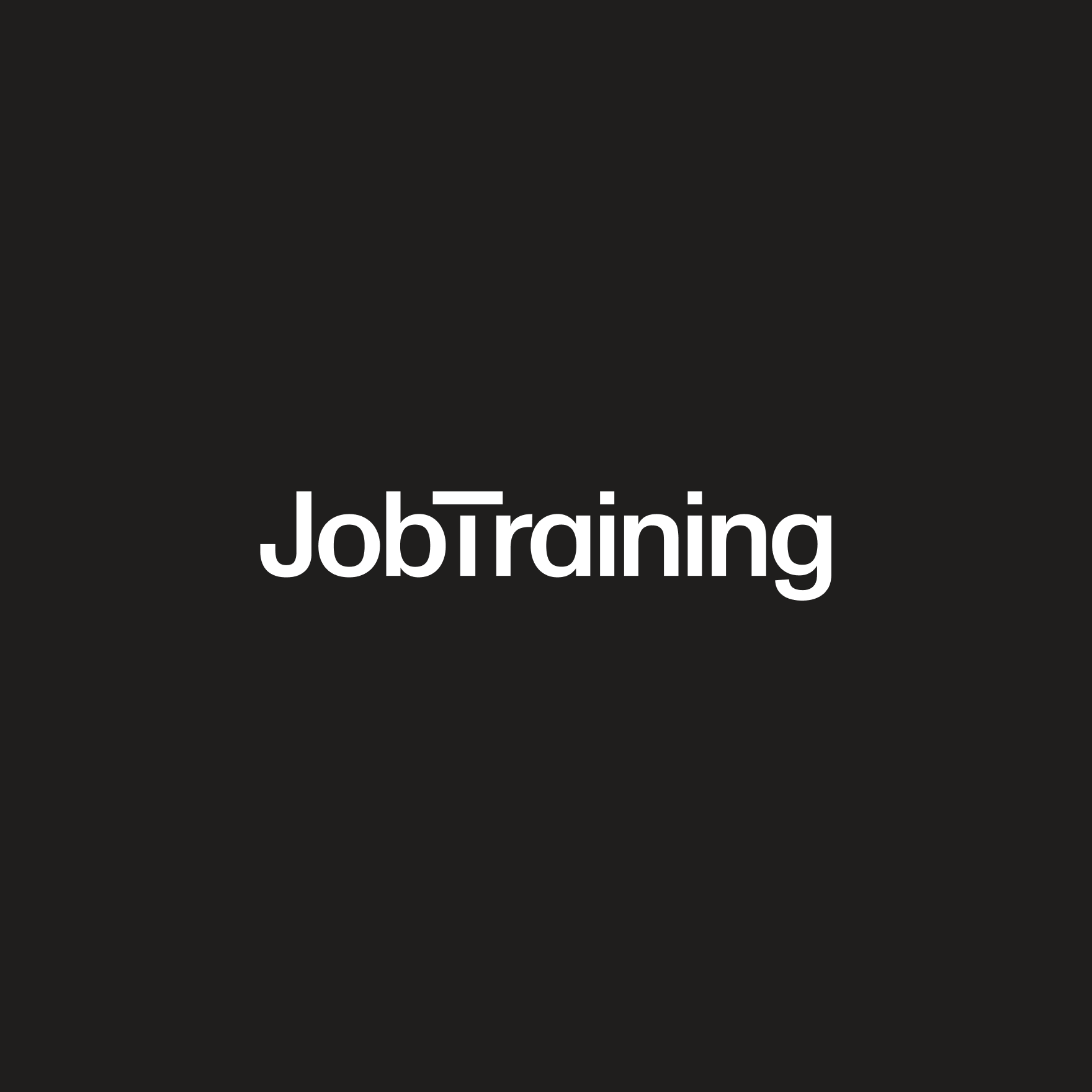
The path one takes during working hours is different for everyone. Some keep it steady, others want it all. Work is not only driven by ambitions.
But personal development happens either way. To find what suites you best, JobTraining is here to let you discover that path. Forwards.
Word mark is based on the typeface Monument Grotesk. Cut was added on the T. Designed at Resoluut.
Delve
Holding the Stone

Heritage feel with a daunting custom take on the V. The dive and rise of personal growth. Making it a timeless and memorable word mark. Not only makes the V up for lost space between the L and E, it also rises to function as the holder of the stone. Keeping this letter V on the same height as the rest creates a calm look, which empowers the heritage feel. The V as the fourth finger. The heritage place for the stone that stands out. The place of eternal love.
Pangram Pangram’s Fragment Glare variable was used to create the word mark. Custom sizing and kerning. Designed at Resoluut.
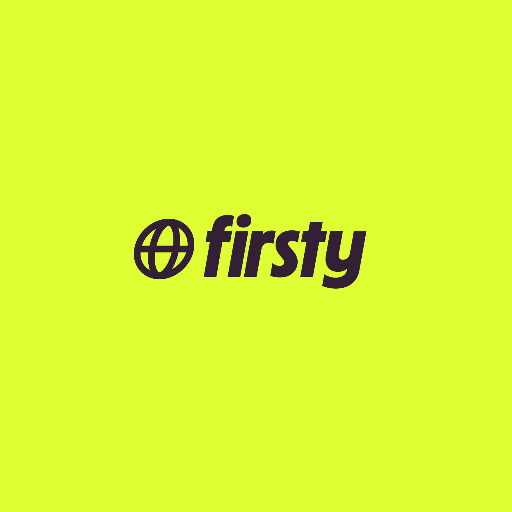
The mark for a global new standard. Firsty's logo encapsulates all the company values in one recognizable icon and wordmark. It's fresh, fair and fast. It expresses the commitment to advancing and becoming the global new standard for mobile internet.
Say hello to Glogo. A take on the general icon for internet and world. Skewed and in motion the Glogo expresses movement, speed and connection.
Custom drawn icon together with MD Nichrome with alternates on the letters T and Y. Designed at Resoluut.
Claro
It's all good!
A washed car just feels good. Claro. The company needed a landmark, a sign for visitors and employees to know it's all good and it's fun to work.
An icon to unify the scattered landscape of carwashes.
Combining the letter C in a hand sign that refers to the brushes of the carwash. Placing it behind the name, because it's only all good after you went through a Claro carwash.
Custom hand drawn icon. Final version by Björn van Ginkel. The wordmark uses Pangram Pangram's Mori. Designed at Resoluut.
Simyo
Keep it simple

In the 2022 re-brand of Simyo, the strategy was to go back to the core of Simyo. Stripping all fluff from the visual identity and focus on the main principles of a optimistic & accessible provider.
Keeping it simple.
Using the original logo, and simplified it to pure uppercase letters for a more steady look. Keeping heritage characteristics such as the Eurostyle S and the 'Tuning Fork' Y, that resonates the network.
Completely hand drawn. Designed at Resoluut
Fixami
Carpenter's Eye

Real craftsmen know what they do and see what work needs. In Dutch, there's a saying for it 'Timmermansoog', which literally is translated to 'Carpenter's Eye'. Or the eye for detail.
The F functions as the first letter, and icon for Fixami. All letters where made in such a way, it represents the tools.
Completely hand drawn. Designed at Resoluut and won Gold at the European Design Awards in 2023 for best logo.
Hotel Pomander
A sense of time and place

Located in Nuremberg, Germany, Hotel Pomander refers to the first made watch in Nuremberg, the Pomander. Also known as the 'Nuremberg Egg'.
The hotel focuses on a blend of times. Rich local history combined with the modern times of now.
The word mark refers to that history using Cirka, heavily inspired by German gothic typoography. The four egg shaped ovals combine with the P create a mark that can be used anywhere.
Pangram Pangram’s Cirka with a custom P and E. Designed at Resoluut.
FinancialLease.nl
Gearbox

Entrepeneurs are adapting any minute to stay ahead of their game. FinancialLease.nl helps them by providing smart car lease solutions that fit any need.
This adaptable mind set is translated into the 'gearbox' F. Fast and dynamic.
Hand drawn. Word mark based on Noi Grotesk Variable by Studio Feixen. Designed at Resoluut.
Eventix
The cheer

Build your crowd with Eventix. As the company aims to let your event by sold out by providing the perfect platform, the logo needed to embody both strategy "Build your Crowd" as the energy and joy that comes with organizing an event.
Next to that the goal of creating an icon, was to become a trademark of trust in the event business. If you see this logo, you know your good.
The icon resembles the crowd, cheering. A universal sign of having a good time.
Word mark based on Cotype's Ambit. Designed at Resoluut
Webflight
Low code, high impact

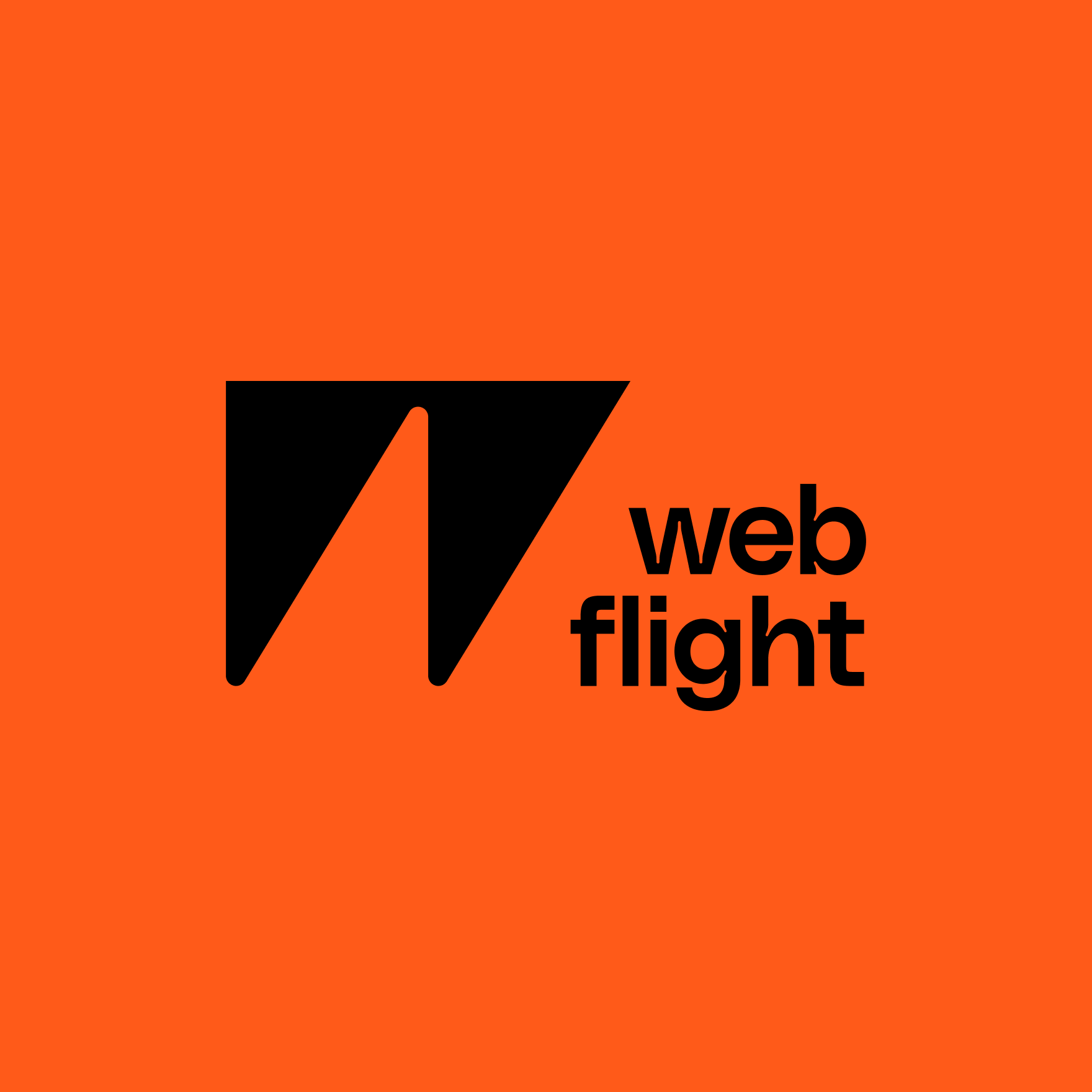
Webflight is tightening the gap between business needs and development. Creating value with low code, that can be implemented fast and smooth. This agility has a high impact on b2b software.
Low code, high impact is visually translated to the W mark. A signifyer for business developer athletes, that aim for winning impact.
The dent on business is translated into the inktrap that is visible in the mark and word mark. Making it a unified piece.
Inspired by the unused Weir Group logo designed by Ken Garland (1963), combined with Polysans by Gradient Type.
